Amsterdam in Letters
typography and architecture
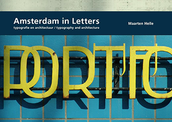
- Get inspired and explore Amsterdam from a new perspective
- A rich and detailed photography book with an emphasis on typography linked to architecture
Editor and photography: Maarten Helle
Contributor: Willem Ellenbroek
Design: Anne Mieke Eggenkamp, Maarten Helle
2008, Valiz | supported by Prins Bernhard Cultuurfonds | hardcover | 192 pp. | 17 x 24 cm (h x w) | Dutch, English | ISBN 978-90-78088-25-7
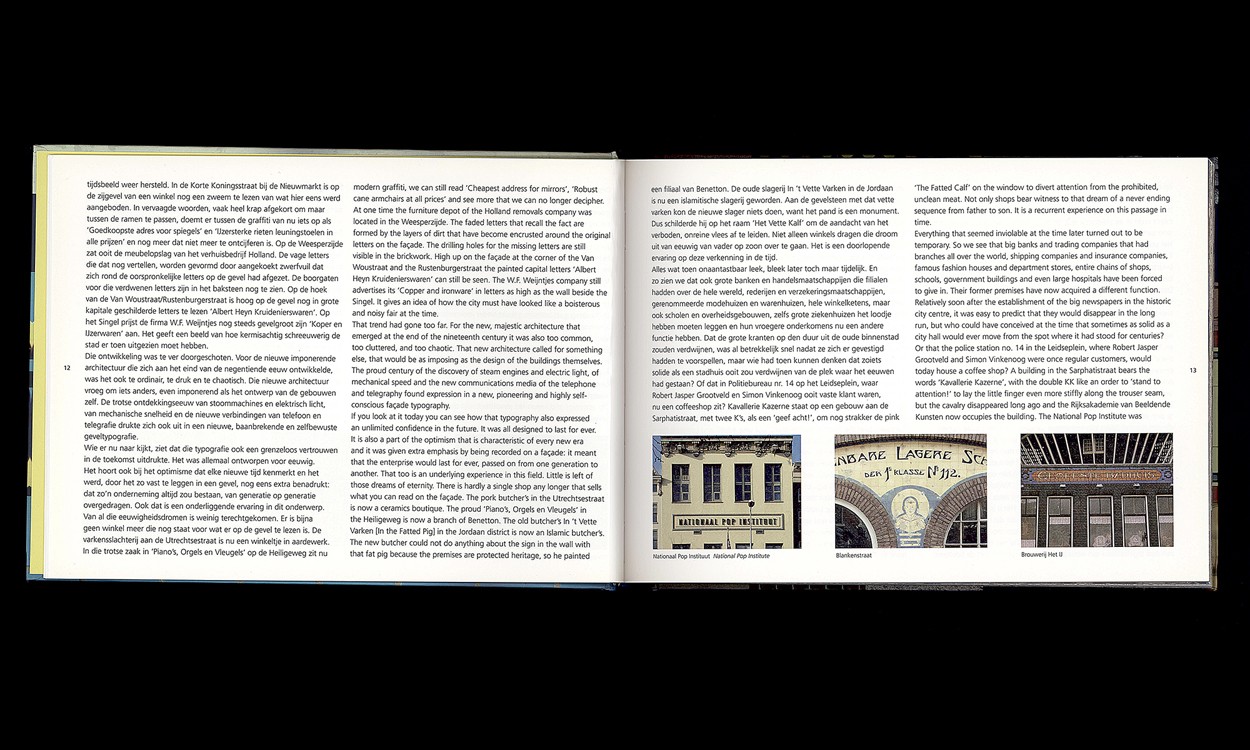
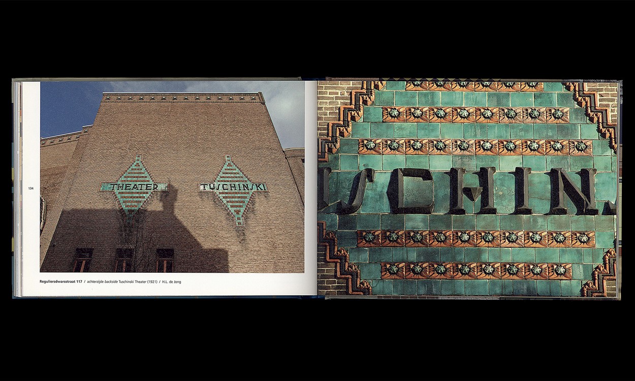
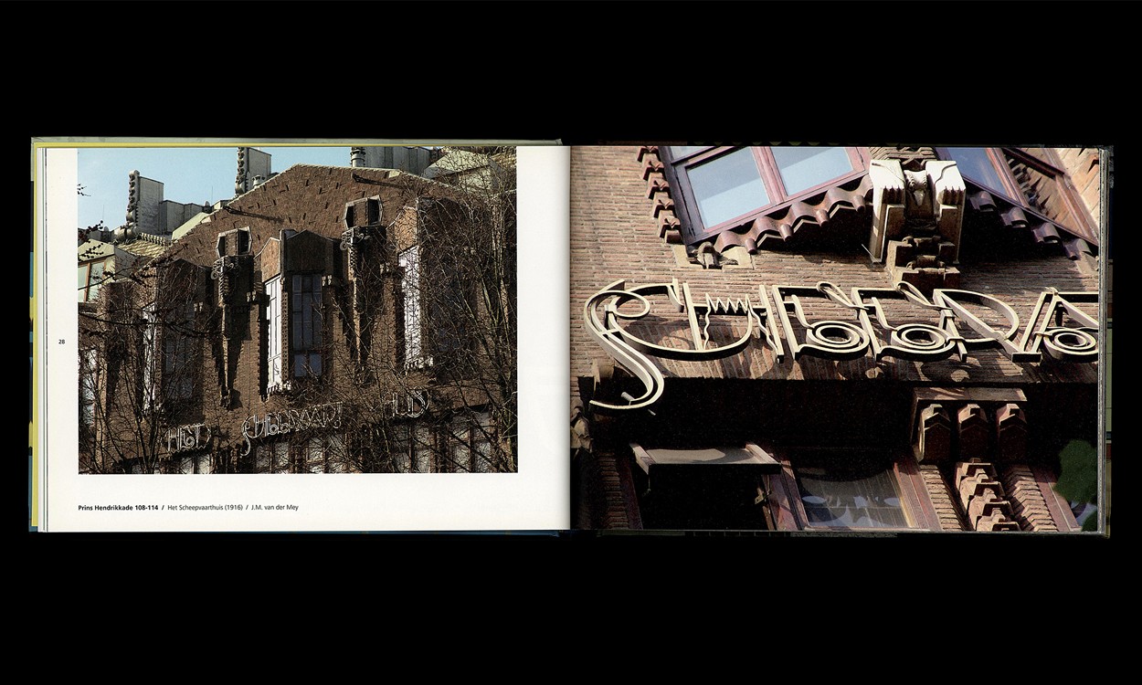
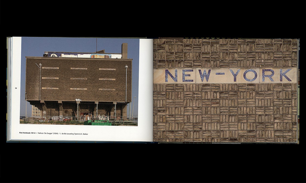
In Amsterdam in Letters, typography and architecture Maarten Helle shows the wide range of letters, names and words that he found on buildings in Amsterdam. He focuses on the typography which is part of the architecture. The almost two hundred pictures show the great diversity of the architectural typography: from graceful Art Nouveau lettering, to the thick letters of the Amsterdam School. Together they form an inspiring series of images, which invites the reader to focus on a phenomenon which is easily ignored in one’s daily routine. The bright and very detailed photography offers a precise look at the texture, colours and materials that are used. The book invites the reader to explore the city; through the typography, the architecture can be explored.

